
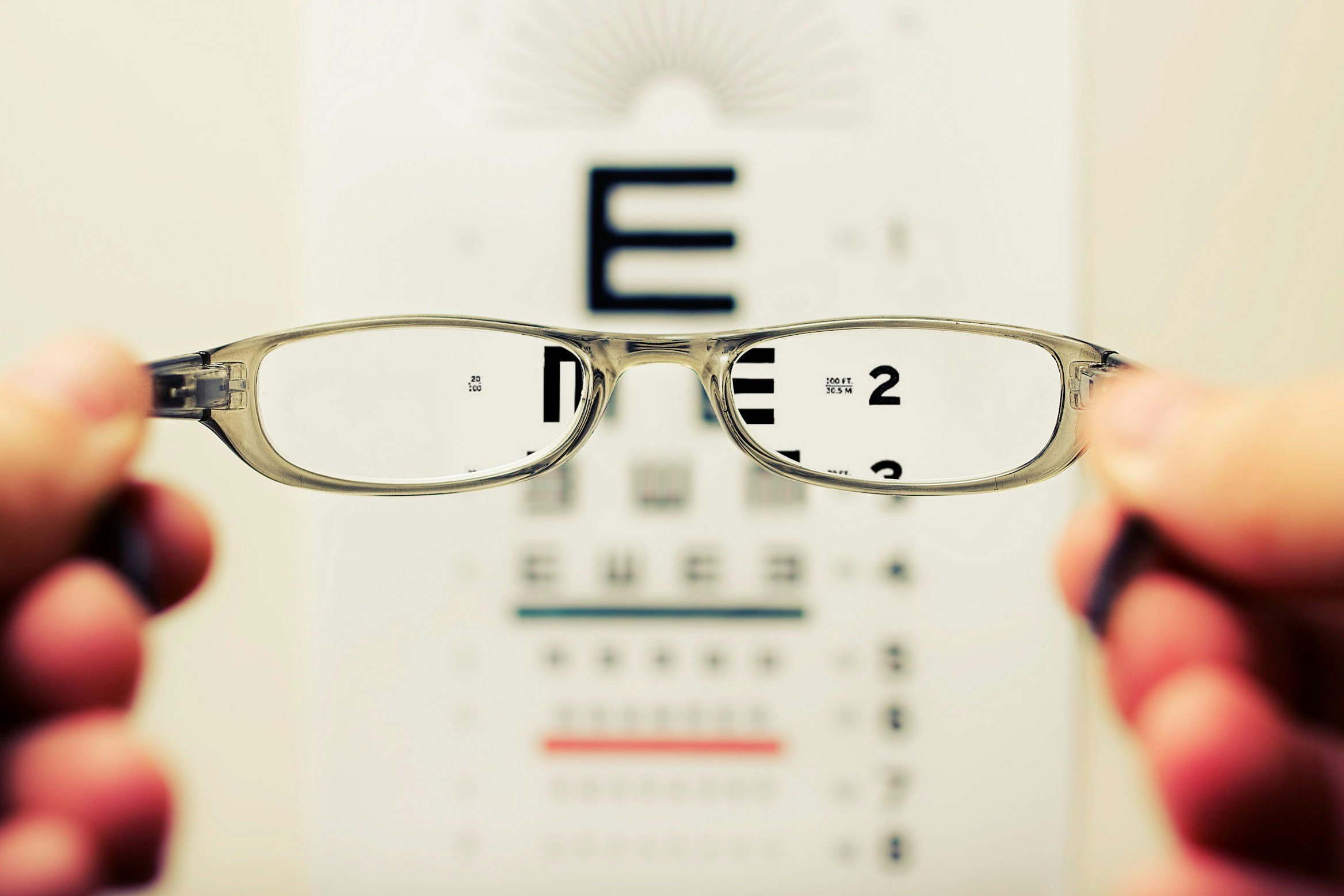
10 tips for website accessibility

On this page
Having an accessible website is a great boost for your website’s engagement. Not only is it the more ethical and inclusive way of designing your website, but it also allows you to have a wider reach and score better on search engine rankings.
In this blog post, we want to discuss what accessibility for a website means and provide some easy tips on ensuring that your website is accessible.
What is web accessibility?
Web accessibility is the practice of making your website accessible for all users regardless of their abilities and disabilities. An accessible and inclusive website is one that users with low vision, colour blindness, cognitive disabilities, live in rural areas and many other abilities and situations can access and use without any issues.
There are bodies such as the Web Accessibility Initiative (WAI) and the World Wide Web Consortium (W3C) that manage web accessibility by creating standards and guidelines. The most notable document is the Web Content Accessibility Guidelines (WCAG). This is a comprehensive guideline that covers all aspects of web accessibility.
Web Content Accessibility Guidelines (WCAG)
WCAG has been designed to help web developers (or anyone who builds a website) ensure their websites are accessible to everyone. It comprises of four main principles:
Perceivable
The content on your website needs to be visible and perceivable. Many users will be using screen reader software that transforms text into speech or other assistive technology. Therefore, your content needs to be perceivable after such transformation.
Operable
An operable website is one that users have no problem accessing and using all the website’s elements and functionality. This could include menus, links, media, and everything else. The most operable websites are simple and they avoid any distraction that could negatively impact the user experience of visually impaired users.
Understandable
The information that you share on your website should be understandable. This includes text, images, graphics, and any other information. Your website structure and expected user behaviour are also important to make your website more understandable.
Robust
To create a robust website you need to ensure that the content of your website is easily readable by users who may use a variety of assistant technologies. To do this you should write your HTML (HyperText Markup Language) code to match the most up-to-date practices that allow different software to read your website correctly.
These four principles are then broken down into different sections and points. The WCAG also provides examples and successful cases to follow. This guideline is constantly being revised and updated, so it’s a good idea to keep an eye out for the latest changes. However, the essence of web accessibility remains the same. Once you understand how it works and why each practice is recommended then you will have a much easier time adapting to new changes.
What is the web accessibility standard?
The principles mentioned above are the metrics for web accessibility standards. Each website is assessed and graded based on how accessible they are. Then they are given a grade of Basic (A), Intermediate (AA), and Advanced (AAA).
If you have a business website and you are offering some kind of product or service to users online, you need to make sure that your website is at least at the intermediate level (AA). Achieving an advanced level (AAA) might be too difficult and costly as you might need to hire experts. However, getting to the (AA) can be achieved by adhering to basic accessibility principles.
10 tips for website accessibility
Here we are going to provide you with simple and easy tips to follow to make your website more accessible and be on your way to achieving an intermediate level (AA) of website accessibility standards.
Use hierarchical structure
How you structure your content on a web page is crucial for accessibility as it affects how screen readers will understand the text and other elements on the page.
Every web page is written with HTML code, where every piece of code has a tag. For instance, the current text that you are reading is written in a <p> (paragraph) tag. A heading will have a <h> tag. These tags will change the styling of the text. There can be multiple headings: heading 1,2,3 with each one getting smaller subsequently.
The reason why this is important for accessibility is that these tags will let screen readers know what type of content they are reading. Therefore, it’s important to keep the structure of the content hierarchical. The main title of your page is going to be a <h1>, so the next heading should be <h2>. Try not to jump from a <h1> to a <h3>.
A sample HTML structure might look like this:
<h1></h1>
<h2></h2>
<h3></h3>
<p></p>
<h3></h3>
<p></p>
<h2></h2>
<p></p>
Another thing to keep in mind is that as you can edit the styling of your text, you can have a heading that looks like a paragraph and vice versa. To someone not using a screen reader this does not make a difference, but if your user is using screen readers they might be confused about how the content is structured. Remember they might be simply scrolling through your content and only want to pick up the headings. Having a proper structure allows all users to engage with it easier and faster.
Add image alt text
Images on a web page have something called an alt text. This element is a text written in the HTML code that describes the photo for users who use screen readers, such as people with low vision or have slow internet.
Adding image alt text also improves SEO rating as search engine crawler bots will have more context about the images in your content. In other words, alt text is searchable by engines like Google, so having alt text is not only helpful for having an accessible website, it will also help you have a more SEO-friendly website.
A good image alt text describes the attributed image with some details using simple and direct language to allow users who can’t see it to understand what it is.
An important thing to keep in mind when writing image alt text is that if the image is only decorative, you may leave it blank. That way screen readers will have a “null” input that allows users to know that the image does not have much of a contextual value and it is only decorative. On Squarespace, this is built into the platform for background images.
Keep your text left-aligned
It is not that rare that we come across a web page that uses left-aligned, centre-aligned, and sometimes even right-aligned text on the same page. The best practice for accessibility is to keep all content left-aligned as much as possible.
Having centre-aligned text is okay as header text, however, it is better to have left-aligned text even for header text.
The reason behind this is that users who use screen readers will find it much easier to scroll through the content and have a better understanding of it. Users from Western countries read from left to right, and so our brains are used to that pattern.

Choose contrasting colours
Keeping colour contrast to a standard level is one of the most vital accessibility practices. This will help people with low vision and colour blindness view your content properly.
To do this you need to ensure that the colours that you choose for your text and background have enough contrast. This will make them easy to understand and the text does not blend in with the background.
There is an easy-to-use browser tool called the Contrast Checker that allows you to check the two colours you have chosen for your design have enough contrast.
After inputting the colours, you receive a contrast ratio. This ratio needs to be at least 4.5. If you are using larger text you could get away with a 3 but it’s best to keep the ratio higher. When using the contrast checker the tool will let you know if your colours pass the contrast ratio or not.
Having a good contrast ratio is not only a desirable practice for accessibility purposes but it also helps in designing a generally better website for all users. Higher contrast allows you to create a more eye-catching website without any fancy design techniques.
Utilise familiar design
Users online are very familiar with the internet and they come across many websites every day. When they are browsing a website they expect it to work just like most other websites they have interacted with.
This simple concept is also known as a UX (User Experience) principle called Jakob’s Law, which states that users spend most of their time on other sites and so they prefer your site to work the same way as all the other sites they already know.
It is sometimes tempting to try something new on your website or make a shortcut and take things in an unconventional way. We don’t want to discourage you from being creative but always think about Jakob’s Law before implementing any features.
Keeping navigation, links and other features of your website familiar and similar to most top websites will ensure that all your users, including users with disabilities, get a better experience as there are fewer surprises along the way and they can figure things out easier and faster.
Keep your website consistent
Keeping the design, structure, and style of your website consistent on all pages will enhance user experience and help users with disabilities to navigate and engage with your website easier.
Consistency in website design makes using your website more enjoyable for all users. It also allows you to establish a sense of branding and character that is unique to your brand.
For users who use screen readers, consistency makes the experience more seamless as they have a better idea of what to expect after visiting one or two pages of your website.
Use clear and simple language
Text and language become more important for users with vision impairment as other visual elements like colour and images might be eliminated. Therefore, when you are developing your website, think about what your text could mean without any visual context. Write your copy so that it doesn’t need visual assistance for comprehension. The text should be self-explanatory.
This is extremely important if you have features on your website that require interaction with users (such as filling out forms). Make sure your instructions are written as text in HTML and not an image. Try to use simple, clear, and effective language in these sections.
Have contextual links and buttons
Following on the previous point, links and buttons are where you need to consider being more specific.
What we mean by that is avoiding the “Learn more” button for three different links on the same page. Get descriptive and contextual to allow users to know what to expect if they were to click on the button or link.
Sometimes, visual elements add more context to links. To make your links and buttons more accessible, write them in such a way that they don’t need visual elements to be understood.
Make your design responsive
Responsive design is something that UX/UI (User Interface) designers emphasise a lot (and for good reason). Just like many other practices on this page, many accessibility principles and best UX principles overlap.
It is general web development knowledge today that you need to check your website on different screens before pushing it live. However, you would be surprised to see how many professional websites get pushed live without a proper responsiveness check!
Websites and programs such as Responsively App that helps you check the responsiveness of your website. Check them on all screen sizes to ensure usability is optimal on all screens.
Faster loading time
Having better performing website helps your website become more accessible to more users. This is because users with slower internet can better access your content. Also, users who are using screen readers will have an easier time engaging with your website because the technology they use to view your content can run much smoother with better optimised webpages.
The main thing thing to look at for a faster loading time is media. Try to minimise the size of your photos as much as possible. Try to avoid heavy files and check your website from different internet connections and devices.
There are a number of website that check your website speed and performance. Page Speed Insights is one, but you can find others you might prefer.